Power, Corruption & Lies (or how I became a typographer, pt. 1)
Occasionally I’m asked how I ended up with seemingly disparate professional interests: typography, programming, lawyering. Simple—much like our physical universe, they emerge from a singularity.
As a kid in New Hampshire, I loved reading and creative writing and playing piano. Books and records were how I learned about what existed beyond my small town.
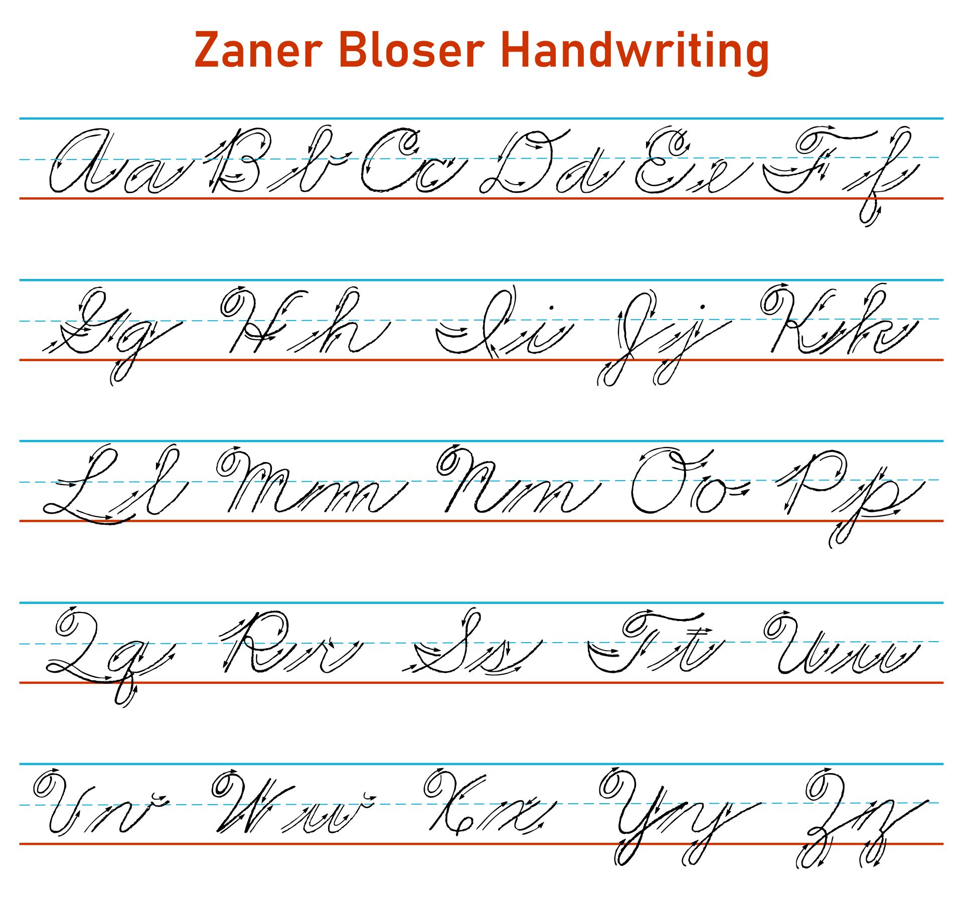
But as a left-hander who struggled with the cursive penmanship then taught in schools—the Zaner-Bloser Method—my handwriting was nigh illegible. (As my teachers often reminded me.)
Speaking with my full authority as a person on the internet, Zaner-Bloser is an insult to written language, handwriting, and children. It claims to be simple and easy to read. No—its loopy, indistinct shapes are a caricature of more mannered handwriting traditions. Ironically, nothing says “childish” more than Z-B writing. This is why every American taught this method finds a moment sometime before their 15th birthday to independently develop a less jejune handwriting technique.
My rebellion against Zaner-Bloser took a different path, however. I found any kind of handwriting slow, and I envied the clean pages my mother was able to produce with her electric typewriter. So for my 10th birthday, she got me my all-time favorite birthday gift: a manual typewriter in a case. (At the time, personal computers were still rare & expensive.) It was my first keyboarded writing tool.
Though I loved writing, I really loved writing with the typewriter. It was faster and easier. Most importantly, adults in power stopped griping about my messy handwriting. By the time I reached high school, I was the only student in my school who routinely typed essay assignments.
Over the years, when skeptics have disputed the value of typography—e.g., “readers don’t pay attention to the presentation, just the substance”—I wonder what their childhoods were like. Because from basically the moment I started writing, I got the exact opposite message: people care a lot about the presentation. And that it would be wise if I started sharing their interest.
Early in high school (1984–86), two other consequential things happened. (Warning: plentiful Gen X cultural reminiscences follow.)
First, the Macintosh computer arrived. It was cool, and the few people who had them were cool. Though I wouldn’t get one till later, a friend’s family had one. I spent as much time at their house as I plausibly could, learning how to use it.
Second, MTV—a then-newish cable channel that played music videos—and that I watched incessantly—showed me this:
I was bowled over. What was I seeing? Today there’s nothing surprising about musicians laconically standing behind machines. But at the time, music had never sounded like this; musicians had never performed like this. It was like these people had arrived from the future to destroy American pop music. They were gear nerds who gave zero fucks and sounded fantastic. That drum solo? That bass solo? That frog solo?
I’m still bowled over. It’s a perfect work of art. Nearly 40 years later, nothing about this clip has aged a day (except the humans).
It was clear I had to join this cause immediately. At the beginning and end of every video, MTV would show a textual overlay at identifying the band, song, and album. This was New Order, “The Perfect Kiss”, from the album Low-Life.
To be fair, in 1985, New Order wasn’t really new. But they weren’t widely known in the US. They weren’t big enough for mainstream radio. If you went to high school in a big city, or listened to college radio, or went to dance clubs, you were probably familiar with them or their precursor, Joy Division. If you were really cool you knew about contemporaries like Gary Numan, Human League, Depeche Mode, and Kraftwerk. The rest of us depended on MTV.
When I got to the record store to get my vinyl copy, this is what I found:
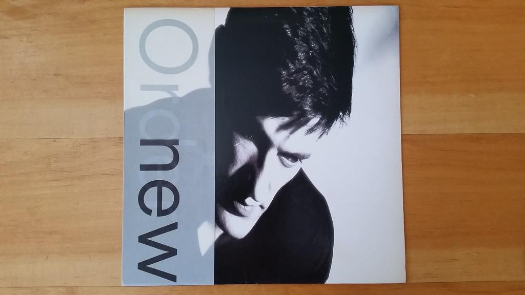
It was arresting. Whatever it was, I wanted it. The photo depicts drummer Stephen Morris—maybe the first & only time in music history where the drummer had the front cover to himself. The typography is a work of elegance and beauty: everything was printed on a translucent strip of paper that wrapped around the sleeve and could slide off. (Without it, there was no type on the cover at all.) The font is Neuzeit S.
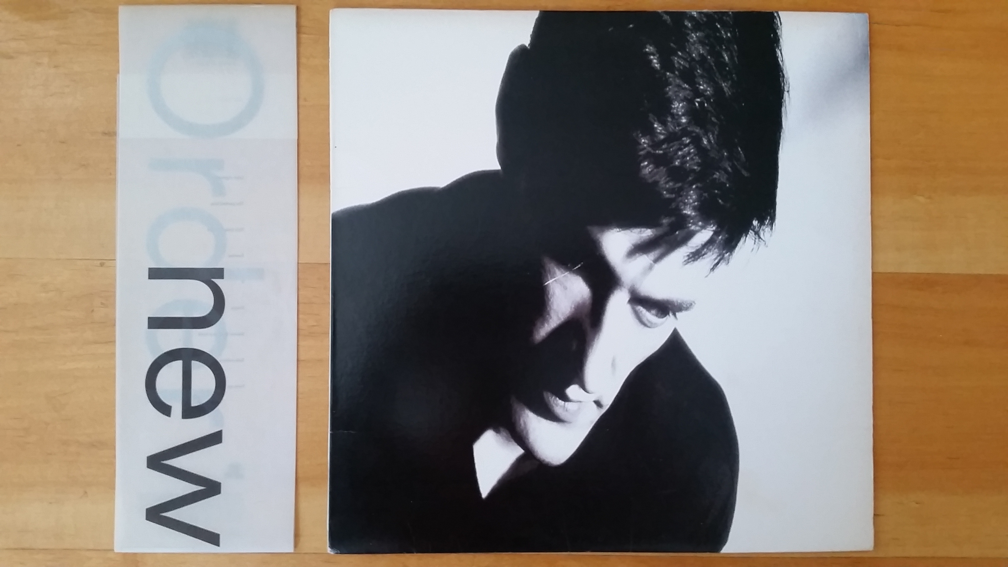
The word “Order” was printed in silver in perfect alignment with the word “new” overprinted in black, the vertical stem of the “n” exactly overlaying that of the “d”. No color at all. (More shots.)
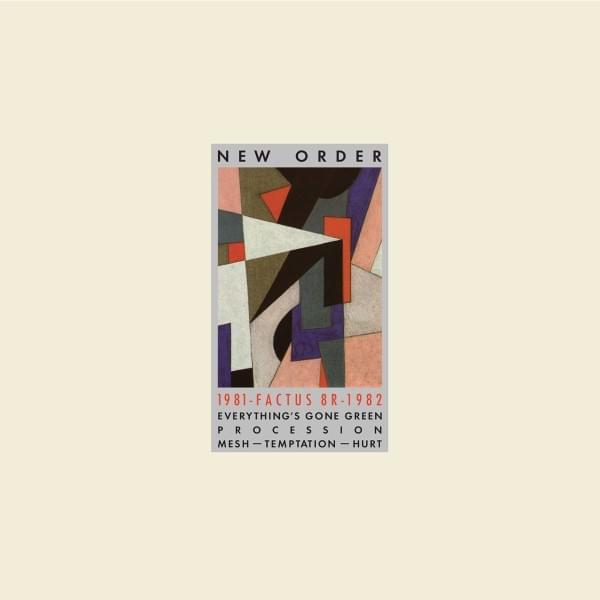
The cover was designed by Peter Saville, who handled all the record covers for Joy Division and New Order (and other acts at their label, Factory Records). I sought out the other ones too.
(Top to bottom: Movement, Factus 8, Power, Corruption & Lies, and from later, Brotherhood and Technique)
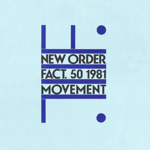

What I love about Saville’s work for New Order is that he manages to be both entirely consistent and utterly not. None of the covers look like any of the others. But they all combine a punchy, charismatic visual concept with a certain sphinx-like mystery: the cover never reveals everything you, the potential record buyer, were hoping to learn. You felt rewarded for your curiosity, a member of a semi-secret club.
According to new-wave lore, this approach was a little too effective for Saville’s sleeve for New Order’s song “Blue Monday”—
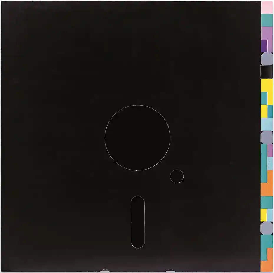
The song was being released in England as a 12” single. Saville persuaded Factory Records to approve a cover design in the style of a floppy disk, with die-cut holes in the outer sleeve and a special grey inner sleeve to complete the effect. Allegedly, Factory had to sell each copy at a small loss, but went forward because it didn’t expect to sell many copies. When the song became a monster hit, Factory got soaked. This account has since been disputed by Saville. If you know anything about record-company accounting, it sounds like an awfully convenient response for when the band asks “hey, where’s all the money from our big single?” (New Order’s financial woes are longstanding and infamous. Their bass player even wrote a book about their financially ruinous experience starting a nightclub, a decision that only a rock band would imagine turning out any differently.)
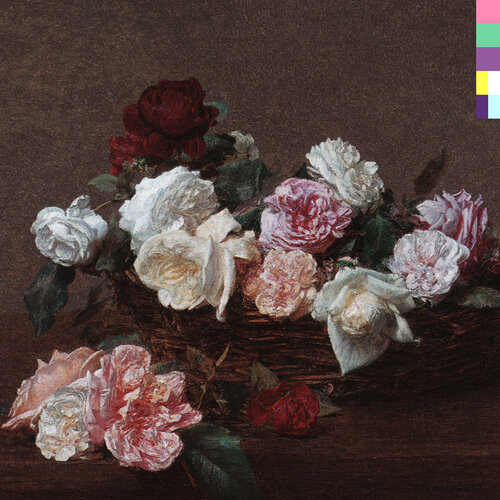
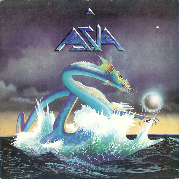
The peril of trusting the design intelligence of pop-music buyers has been well satirized. But Saville understood that his covers were being displayed in record stores full of other albums (with bigger marketing budgets). His goal was not only truth and beauty—that is, making the outward presentation a characteristic depiction of the music within—but also maximum effect for the design dollar. At a 1980s record store, the Fantin-Latour painting on the cover of Power, Corruption & Lies stood out. Album covers of the era were typically more of a blend of warmed-over 1970s imagery with corporatist 1980s gloss, for instance:
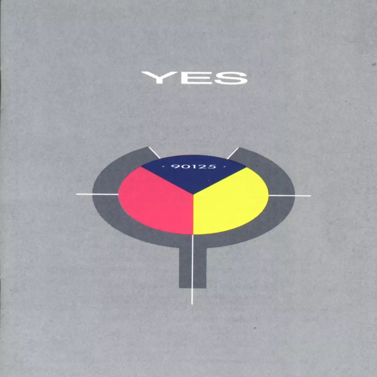
Or this one, which seems like a big-budget, zero-taste knockoff of Saville:
My affection for the typewriter had started me along a path. But seeing Saville’s work for New Order was the first time I recall becoming aware of the real expressive power of design. Saville never subscribed to the idea that the record cover is merely packaging, and that the designer should find a way to be courteously deferential to the band and the music. No, the record cover is not the destination. But it is part of the journey. It can add complementary meaning and enjoyment to the experience of the music.
Outwardly, my work as a designer bears no resemblance to Saville’s. (Indeed, he sometimes uses no typography at all.) But his principles have stuck with me.
I always think about—and encourage others to think about—how design and typography can complement the underlying object by finding a way to communicate its virtues. If your writing contains beautiful ideas, then your presentation of that writing should be likewise beautiful.
I also like that Saville never sold short the intellect and taste of his audience. His work was never boring. And he always reserved a little of the heavy lifting for the person on the other side. Because as a reader—or record buyer, or software user—the journey becomes more meaningful when you contribute some of your own curiosity, because curiosity reinforces reader attention.
(By the way, if you haven’t listened to New Order, I recommend starting with Substance, then moving on to Power, Corruption & Lies, Brotherhood, and Republic for the deeper cuts.)