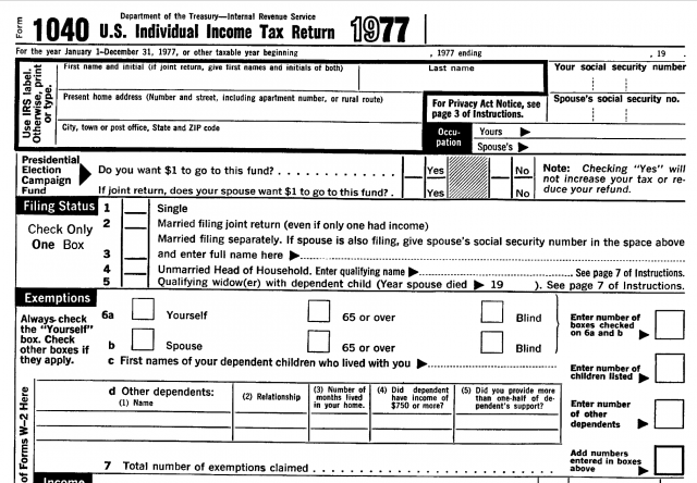
The best typography in the US federal government
The forms and publications produced by the Internal Revenue Service, of course, most famously Form 1040. I would love to have a book of IRS forms over the years, purely for the design. (Note to self: this could probably be accomplished with a couple of FOIA requests.)
Though no one likes paying taxes, fans of typographic design should pause to appreciate just how difficult this project must be, which makes the result all the more impressive. These forms necessarily represent a collaboration between IRS lawyers (who have to make sure the forms are accurate relative to the ever-changing thicket of tax law), graphic designers (who have to create visual hierarchy & order while preserving an economical density of information), a warehouse of fact-checkers and proofreaders who have to make sure the forms are flawless before they head to the printer (can you imagine the costs of getting a form wrong?), and some chain of command that has approval over all of it.

I’ve been involved in some complicated design & printing projects. Whenever I try to unpack the practicalities of how this all works, it becomes fractally mind-bending. Truly: no idea how they do it. And they do it every year.
Wait, that’s not even the best part. The other indispensable collaborator in these forms are US taxpayers themselves. It would be one thing if the IRS were just churning out textbook-style explanations of US tax law. But these are forms meant to be used interactively to compute results, much like a software program on a computer. So in addition to the other requirements, the designers have to create a logical, ergonomic visual path through each form.
IRS forms are often teased for being dense and inscrutable. But when you consider the requirements—and the alternatives—this is the certainly the best-case scenario: a US government agency that puts a huge effort into making sure its work is understood by the citizens it serves. And much of that effort is typography.
I salute you, IRS.