Choose wisely (2020 edition)
Confidential to my readers in the United States
As a typographer, my most important role during an escalating health / economic / climate catastrophe is to help “A Shattered Nation … Care About Stupid Bullshit Again”. We’ll get to that, as always.
But first: yet another reminder to please vote. Vote.org has a great guide to early voting (which is already open in certain states). If you’re mailing your ballot, do so as early as you can, because yes, the mail delays are real.
By the way, the Democratic candidate who had what I thought was the best 2020 campaign typography ended up getting the nomination.
Equity in the Fifth Circuit
The U.S. Court of Appeals for the Fifth Circuit handles appeals from the federal district courts in Texas, Louisiana, and Mississippi. I’m hugely complimented that this summer, it became the first U.S. circuit court to adopt Equity as its official font for its opinions and orders.
Fifth Circuit Judge Don Willett—a longtime fan of typography—wrote about the process in the current issue of The Advocate (a publication only available to members of the State Bar of Texas, I’m afraid). He describes Equity as “a Rolls-Royce (or better, a fully loaded Ford F-150)” (from a Texan jurist, high praise indeed). He also explains the broader rationale for the restyling project:
[Why] did the circuit devote finite judicial energy to swapping typefaces and widening margins? Simple answer: Our job is not just to present clear opinions, but to present our opinions clearly. Getting the law right is, of course, our tip-top priority. Nothing matters more. … But good enough is never good enough. Our work is consequential, impacting the lives and livelihoods of real people walloped by real problems in the real world. The stakes are high, and we must present our best opinion, not merely a passable one. And that presentation begins before the first word is ever read.
I agree completely. As some of you know, when I started the Typography for Lawyers project in 2008 (as a website), I figured it would attract a small following of like-minded nerdy lawyers. It’s always been pleasantly surprising and gratifying to watch the snowballing acceptance of these ideas.
The Apple Extended Keyboard II
I don’t have any nostalgia for ’90s computer hardware, with one exception. The Apple Extended Keyboard II, made from 1990–95, has never been surpassed.
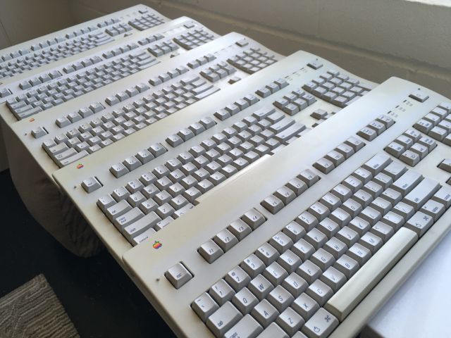
After some years trying out modern approximations—the Matias Tactile Pro came the closest—I got a couple vintage AEKs in 2017. The first one lasted three years before the shift key gave out recently. I had a spare. But I just got five more to hold in reserve, as their prices have doubled since then. (For enough money, you can still get one new in the box.) I plan to announce my retirement from computing the day after the last one breaks.
Font in progress: Heliotrope
It’s not quite done, but my next font release—one of two families I’ve designed during the pandemic so far—will be a part-sans part-serif family called Heliotrope. I’ve been using a prototype on Beautiful Racket for body text.
Gentlemen Broncos
New Yorker film critic Richard Brody & I are apparently the only members of the Gentlemen Broncos army. But six months into the pandemic, if you’re looking for a left-field recommendation now that you’ve binge-watched everything else—here it is. This is one of my favorite movies. Not least because of its amazing opening-credits montage of fake 1970s sci-fi novel covers, recreated with immaculate attention to period typography. As a professional typographer and lifelong nerd, it always pleases me to see this kind of relentless commitment to irrational levels of accuracy.
update, 549 days later
Eventually I caved and got one of those new-in-box Apple Extended Keyboards. I justified it on the grounds that it’s the object my hands touch the most over the course of a year. I worried that I would open the box and out would drift nothing more than a small post-it note saying “sucker”. But no—it was just as advertised. It felt a little strange to break open the plastic seal on this beautifully preserved artifact. But having done so—it is fabulous.