The problem with “pretty”
Frequently, lawyers discovering typography for the first time have said to me “Now I get it! Typography is about making things pretty!”
On a certain level, I can’t dispute this. Our ambition as typographers is not to make things uglier.
But pretty also sells typography short. When typography is used well, it can be subtle and powerful. It adds complementary meaning to the written word.
This past week, I saw two very effective examples of legal typography: one infuriating, the other heartbreaking.
Proposition 22
In 2018, the California Supreme Court issued its Dynamex decision, which restricted the ability of companies operating in California to classify workers as contractors.
In 2019, the California legislature codified this decision in a bill known as AB 5. Though AB 5 applied to all businesses, it was considered especially consequential for companies with ridesharing and delivery apps (like Uber, Lyft, Instacart, and Postmates) who had long contended that they ought to be able to treat their drivers as contractors. The answer from the legislature and courts had been loud and clear—no way.
In many states, that would’ve been the end of the story. But California permits ballot initiatives: a system whereby private parties can propose changes to California law. If these propositions meet certain criteria, they are put to a statewide vote.
This year, the ride-sharing companies spent over $200 million promoting Proposition 22, a ballot initiative designed to exempt their drivers from the requirements of Dynamex and AB 5.
Part of that money was spent on this really terrific poster campaign:
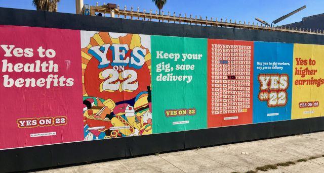
As a typographer, I love these posters. The colors and typography evoke old-fashioned signpainting and idealistic ’60s psychedelia. The word YES is the centerpiece—of course! Who wouldn’t want to vote YES? It makes you feel like when you do, you’re going to be a labor-rights hero, lifted on the wings of a unicorn. It’s a great visual concept, executed well.
The problem, of course, is that it’s almost entirely bullshit. In this case, voting YES means enshrining in law the small concessions on pay and benefits that the ridesharing companies are willing to make, which fall far short of the standard already set by the California courts and legislature. True, the posters were pretty—but in this case the pretty is being used to cover up the odious & ugly nonsense within.*
Still, this seemed like the kind of effort that the heavily liberal voters of California would reject in this election—after all, the Democratic presidential candidate prevailed by almost 30 points. Wrong: Prop. 22 won by 17 points. Pretty paid off.
Jamison v. McClendon
From the ridiculous to the sublime. A reader sent me a copy of U.S. District Judge Carlton Reeves’s opinion in Jamison v. McClendon, issued in August 2020. I had seen some news mentions of this opinion; I hadn’t seen the opinion itself.
Take a look, because in terms of typography for lawyers, this is as good as it gets.
Judge Reeves’s overall document typography is excellent, with generous page margins and tidy body text (to my eye, reminiscent of the opinions of the Seventh Circuit).
But there’s more. He opens his opinion—an “Order Granting Qualified Immunity”—with 19 single-line paragraphs spread over four pages. Each line ends in a footnote.
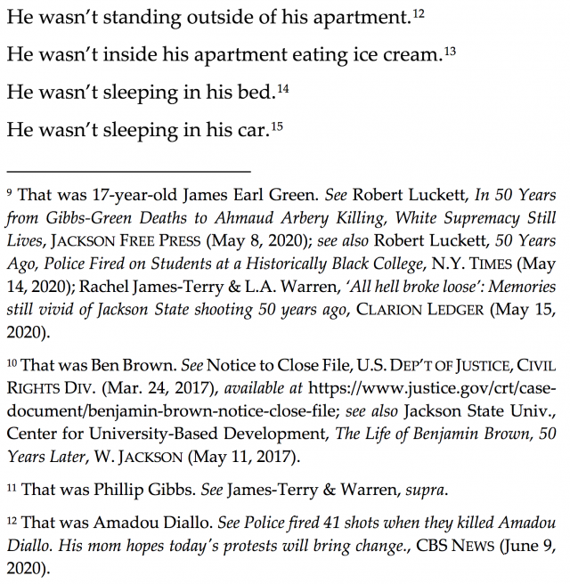
As readers, it takes us a moment to understand what’s happening, as our eye cycles between the upper part of the page and the lower. But then we see: each footnote memorializes a Black person who died during an encounter with law enforcement. After that, each line resounds like the tolling of a bell. Even the footnote-reference number becomes freighted: it is also a death count, ticking upward, page by page.
Pretty isn’t the right word, is it? This typography is elegant, unexpected, concise, and powerful. Footnotes, sometimes the refuge of the discursive or sloppy writer, are here used in a potent, emotional way.
But that, to me, is where the magic of typography lies. Imagine how other judges or lawyers would’ve probably presented this material. They might’ve made it dense and dull, thereby diluting the impact. Or they might’ve gone the other direction, making the page bold and shouty when it should be solemn.
As a writer, Judge Reeves understands that there is nothing more harrowing than the facts, simply stated. This is reflected in both the words on the page and the way they’re presented typographically. Truly beautiful work.
(The rest of the opinion is excellent also—careful readers will notice that Judge Reeves slips in some sly references to Star Wars.)
* Or, if you agree with the ridesharing companies, then the prettiness of the packaging is consistent with the beautiful & wonderful ideas within. But given that these companies weren’t making money even when they were flouting California law, it’s hard to understand how Prop. 22 really changes their long-term outlook.
update, 305 days later
In August 2021, Prop. 22 was ruled unconstitutional.