Short-fingered vulgarians at the gate (or how I became a typographer, pt. 2)
As I mentioned in pt. 1, I grew up in southern New Hampshire. That part of NH is less rural than the rest of the state. But still more rural than the rest of the country.
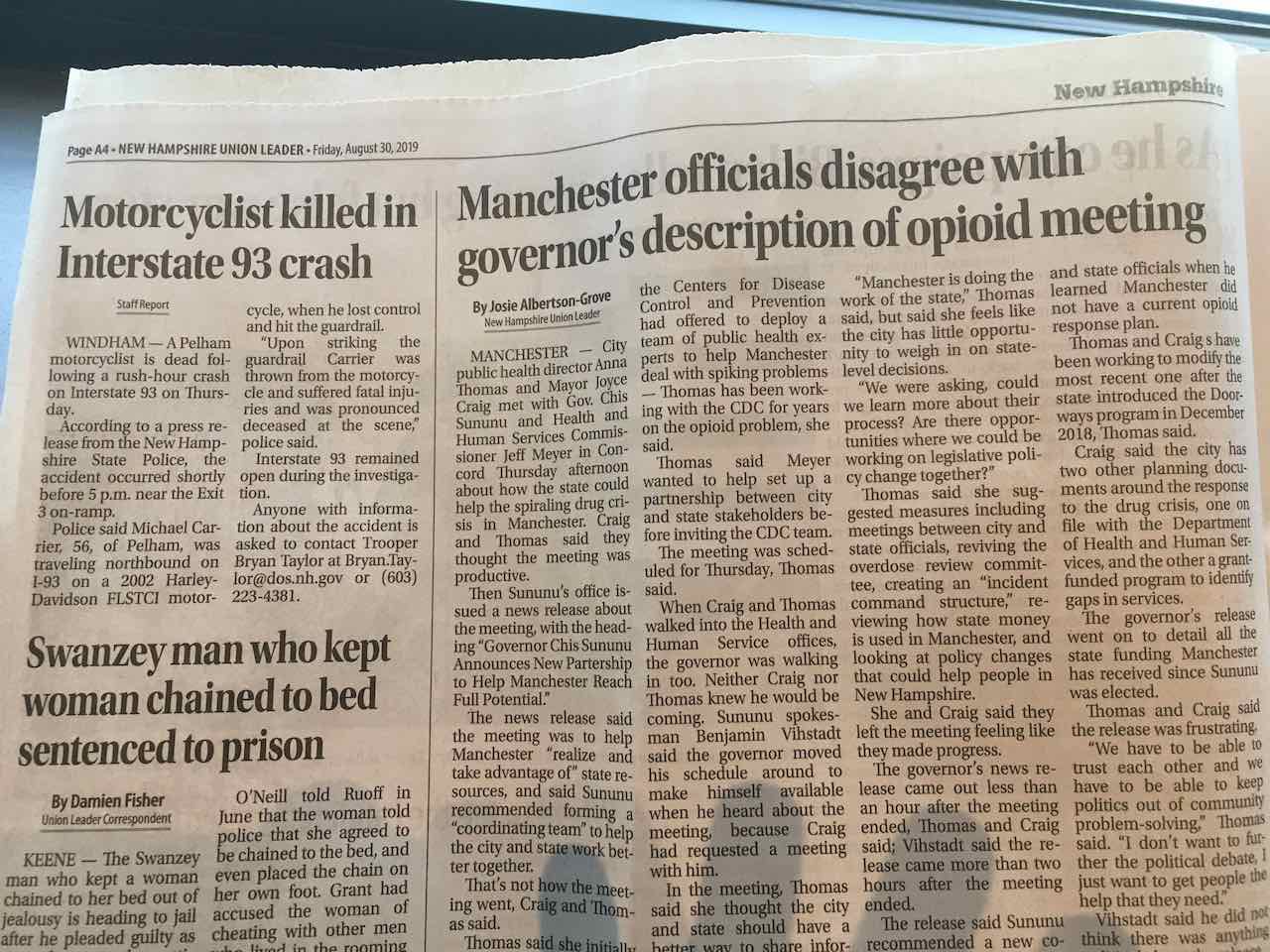
My hometown paper, the Union Leader, was famous in those days for publishing reader letters. Not just some of them—all of them. (And thus maybe deserves to be considered a forebear of internet-based social media.)
The page below, seen during my last visit to NH, includes three headlines that basically run every day with small variations—opioids, motorcycles, and weirdos.
In my 2L remedies class, my professor joked that bitty New Hampshire probably only had seven people in its state legislature. Well actually, professor, it has 400. According to entrenched NH state-government lore, that makes it the fourth-largest legislative body in the world. (According to a reader, this is not even close to being true. What’s your point?)
As time passes, these quirks—we could add to that pile no income tax, no sales tax, no helmet law, and most intransigently of all, no seatbelt law—seem less like the product of some flinty, independent-minded state character, and more like adolescent self-absorption.
Nowhere is this more evident than presidential-primary season, a quadrennial pageant where New Hampshirites plainly see themselves as the stars. This has long been one of the worst ideas in US politics: allowing a tiny, homogeneous, rural state to monopolize the pole position on the primary calendar. And yet—New Hampshire tenaciously retained that position for a century, against all political logic. (In 2024, it will go second, on the same day as Nevada, which means absolutely no one will care, except the Union Leader.)
Not to sound mean. Local boosterism is charmingly parochial wherever you go. Give NH credit for parlaying its otherwise indistinct portfolio as a United State into something more. For most everything NH is known for, better versions exist in Vermont. In 2000, NH put its only major landmark—a natural rock formation optimistically called the Old Man in the Mountain—on its state quarter. Three years later, it collapsed. An omen? During my last visit, NH felt less invested in its own culture, and more like a northern suburb of Boston. In my day, parents did not let their children grow up to be Massholes.
Later, I would live in the big cities where coastal elites would enjoy the humor of The Onion. But those raised in big cities tended to understand The Onion strictly as a parody of the news. For those raised elsewhere, The Onion was more deeply a parody of small-town newspapering, with all its petty preoccupations.
Bringing us to Spy magazine
Spy started publishing in late 1986. (A complete online archive of the magazine is available—have a look before some buzzkilling lawyer ruins it for everyone.) I’m pretty sure I wouldn’t have seen it until fall 1988, when I started college and had access to campus newsstands. For reasons that will become clear, it is literally impossible to imagine anyone in Spy’s business department arranging to ship cartons of the magazine to bookstores in New Hampshire.
Spy was not a parody of the news in the sense of making things up. But it satirized the rich and famous and powerful of New York City, and the publications—e.g., Vanity Fair, the New Yorker, the New York Post, and most of all the New York Times—that helped amplify their preferred public personas. (In a reversal, Spy’s founding editor Graydon Carter would leave in 1992 to become the editor of Vanity Fair.)
Spy’s angle was to cover the same people, but focus on reality: the catty, immature, cheap, grubby behavior that burbled just below the surface (or, in many cases, spilled into plain sight). Spy’s editorial voice was that of a small-town newspaper where the town in question was the tiny, insular domain of the wealthy and powerful. As such, Spy’s other close antecedent was Mad magazine—I own about 100 back issues, mostly from its countercultural heyday—which also never missed a chance to deflate the powerful with puerile humor.
As a New Hampshire native, the world Spy depicted was largely foreign to me. So were many of the recurring characters—Henry Kravis? Binky Urban? Donald Trump? (Who was always introduced as “short-fingered vulgarian”, a sobriquet he disputed for decades.) But their striving and tribulations and pettiness and half-baked plans were universally recognizable. They were treated as cartoon characters, but—aside from the baroque stipples of Drew Friedman and a handful of others—there were no cartoons, just text. A comic book for the literate and the literary.
Bringing us to the typography
The founding editors of Spy—Graydon Carter and Kurt Andersen—correctly assessed that one of the best ways to get attention for a young, low-budget magazine was to hire a young, low-budget typographic designer to give the interior a characteristic flavor. The initial designer was Stephen Doyle, who after the fourth issue passed the reins to Alexander Isley. Both are alive and well and still designing things.
I would’ve supposed that Doyle & Isley were sick of hearing about Spy. But a few years ago, I sent Isley some fan mail anyhow. Not only did he accept the compliment with kindness and gratitude, he told me he was—gasp—likewise a fan of Typography for Lawyers. I’m not worthy!
Because as a designer, no single work of typography has been as influential on me as Spy magazine. Thus, in some way, whatever I’ve done in my typographic career owes a debt to Doyle & Isley. A modest public encomium is long overdue.
“Oh come on. You’re not inspired by the Incunabula? The Arts & Crafts movement?” At age 17? Nope—I hadn’t seen any of that. (Now? Uh—a little.) New Order albums made the first major typographic impression. But Spy was next: it was the first magazine where I really noticed the typography. It looked like nothing else. Not only did I want to read it, I wanted to know how they did it. And whether, armed with a Macintosh Plus, I could too. (Answer: no.)
One of the best decisions Doyle made was basing the design on two text faces—Garamond 3, designed by M. F. Benton, and Metro, designed by W. A. Dwiggins—that had been reasonably popular in the earlier part of the 20th century but had since gone obscure. As a type designer, I’ve typically been a proponent of using fonts by living designers. But the mid-’80s were an awkward moment, as mainstream typography pivoted from the banality of late phototypesetting to the banality of early digital typesetting.
For Spy, historical type worked better: the whole magazine sought to upend a certain entrenched story of New York fame and wealth. Visually, the subversion of Garamond 3 and Metro became an analogy to what Spy did to its subjects: sometimes they were handled carefully; sometimes they were butchered. As Doyle later said, the layout was “our reaction against clean minimalism” that was then prevalent.
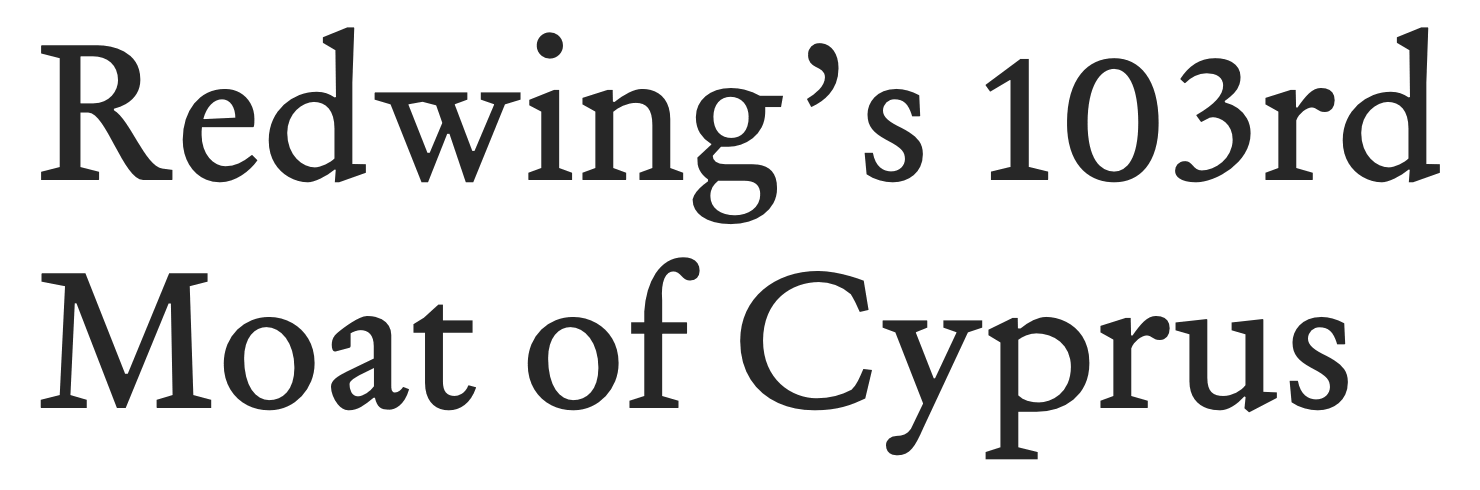
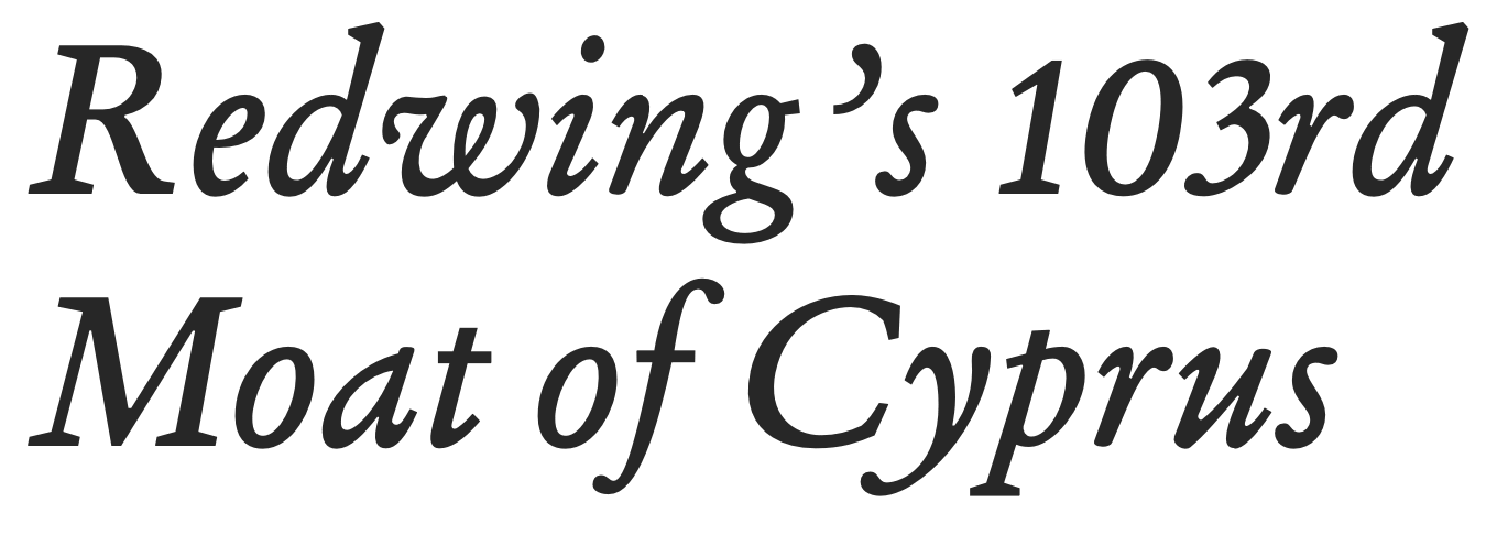
Whereas new fonts of that era tried to achieve the smoothest possible finish, Garamond 3 and Metro were packed with weird details that kept the pages lively. They remain two of my favorites. Metro was a big influence on Concourse. (I’ve also designed a text face in the spirit of Garamond 3—previewed below—though so far I’m the only one who gets to use it.)
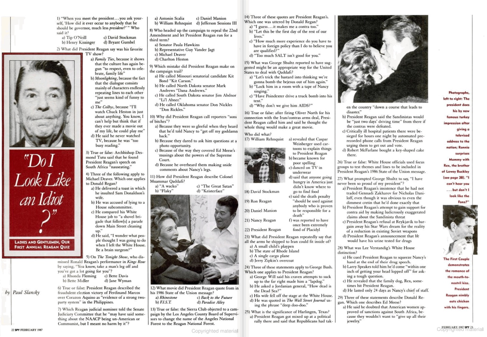
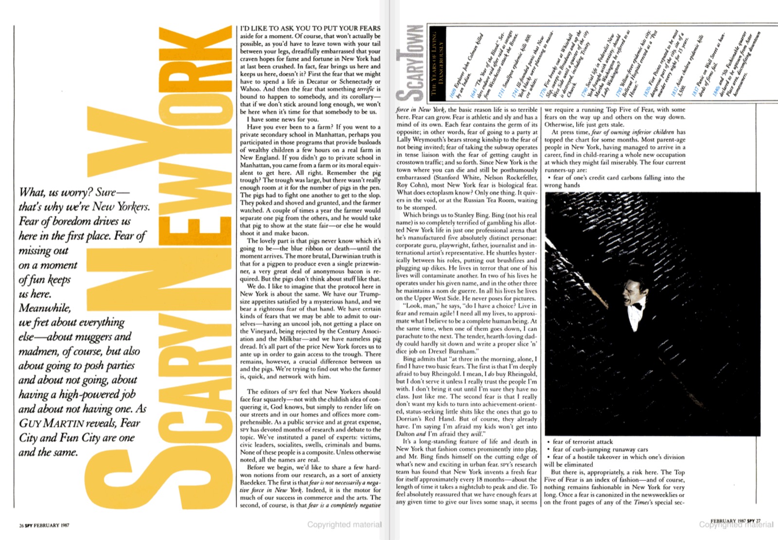
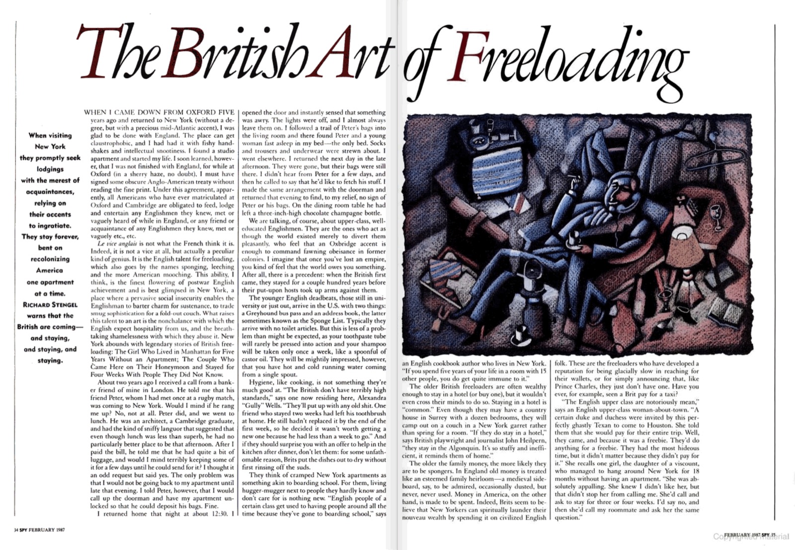
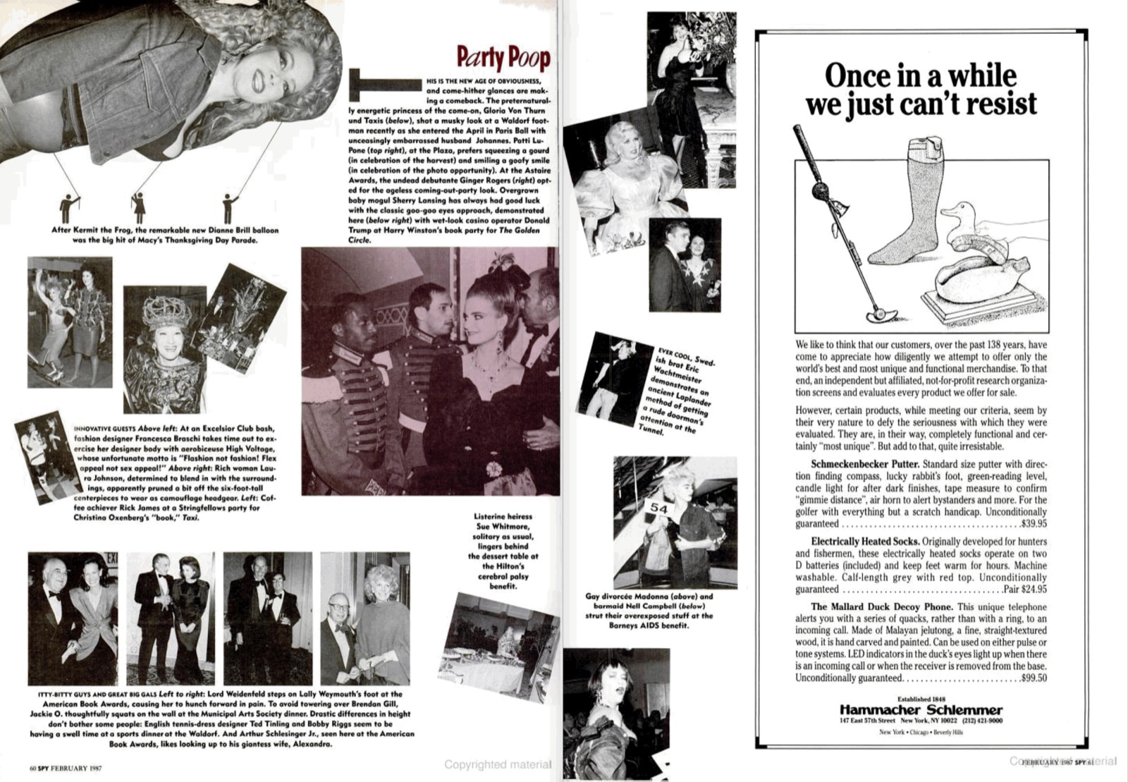
Even though Spy emerged at the dawn of the desktop-publishing era, its densely packed layouts were, due to budget constraints, produced using traditional layout techniques. Boggling. To demonstrate the ludicrous amount of typographic japery you still got in each issue of Spy, I’ll show you a set of spreads from one month—February 1987, the last issue designed by Doyle. I still don’t know how they did it, though I can’t rule out certain performance-enhancing compounds common in New York at the time.
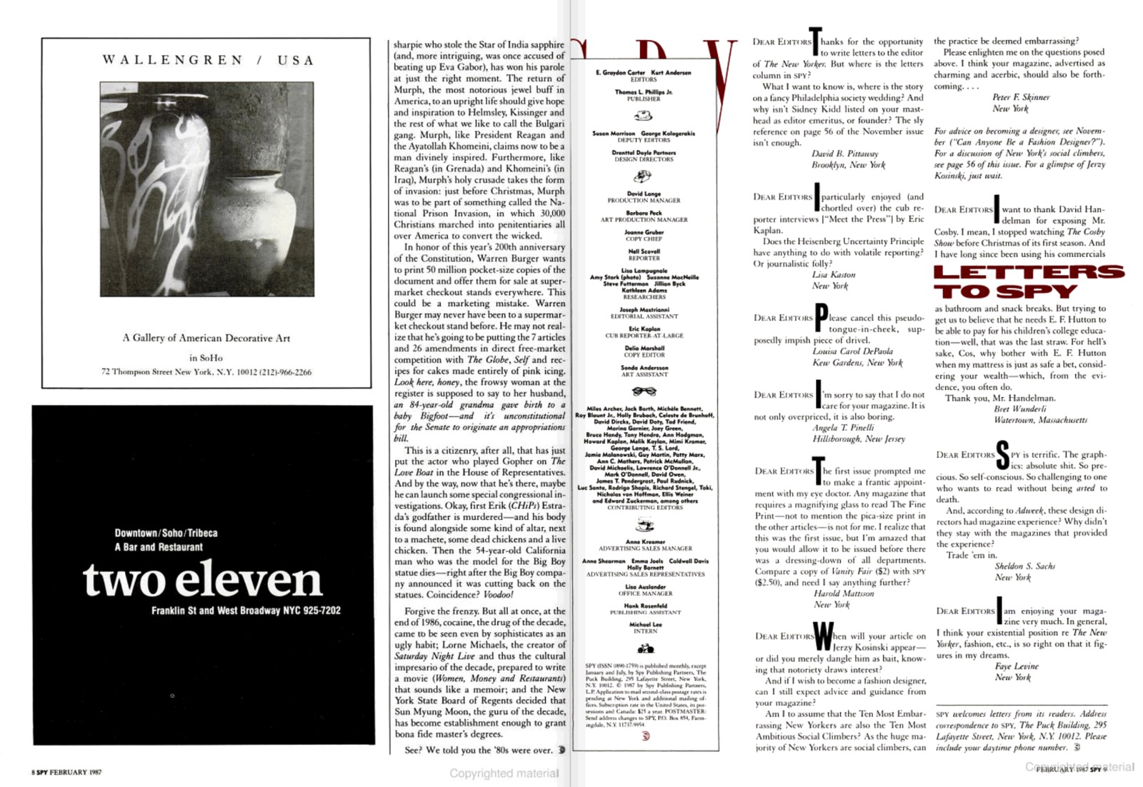
The front section of Spy, “Naked City”, was gleefully excessive. Spreads like this were a direct influence on the paperback Typography for Lawyers, where I used as many fonts as I thought I could get away with. For some it was too much; for others, just right. Je ne regrette rien.
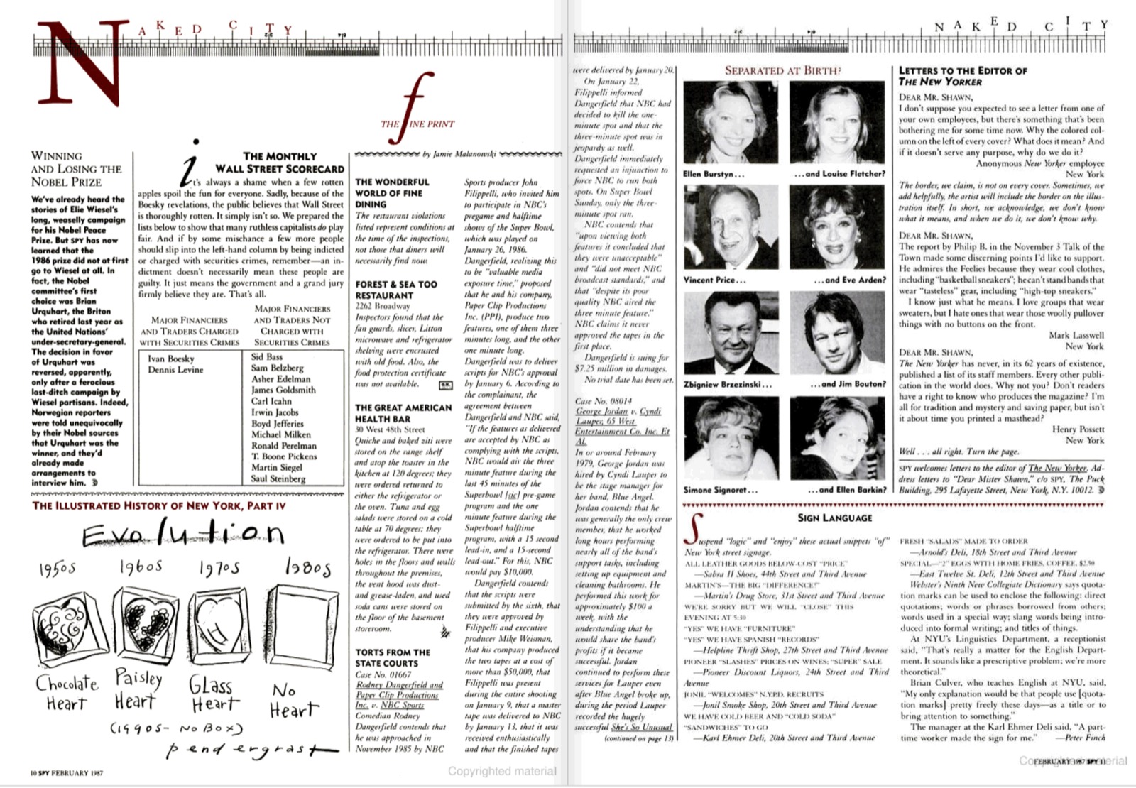
I liked that the layout presented multiple possible starting points, catching the eye as well as the mind. The left side of the page is part of an extended New Yorker joke, in even tinier type.
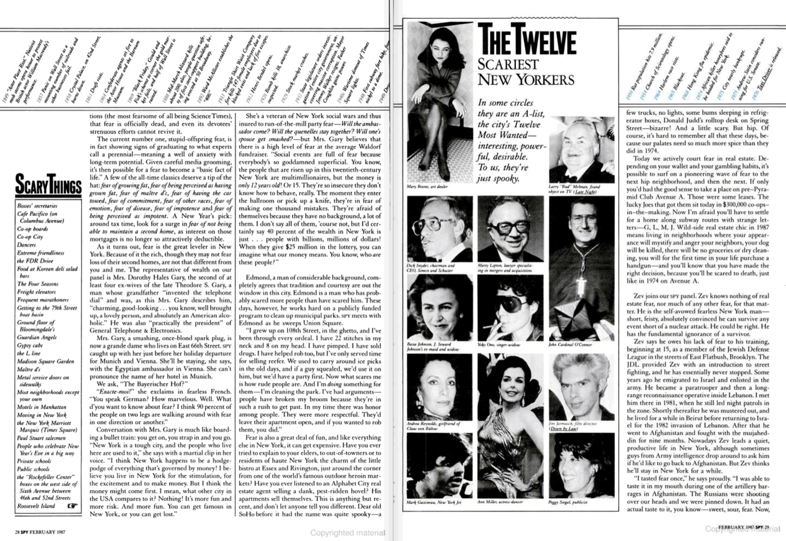
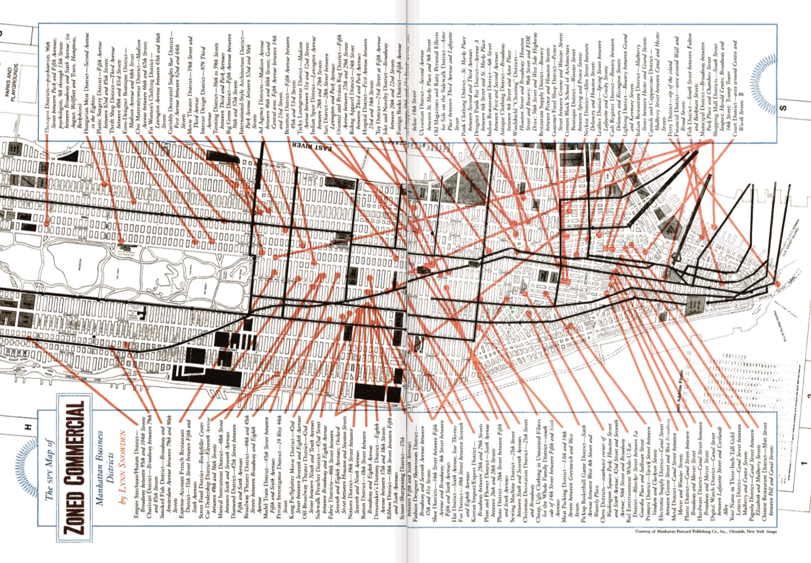
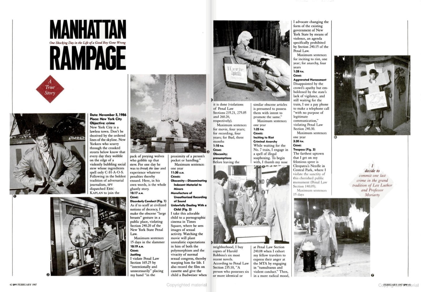
Spy was big on lists, maps, charts and other laboriously tweezed-together infographics.
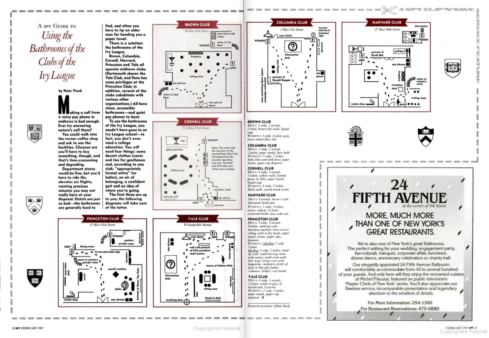
Detailed maps for using the bathrooms at NYC’s private Ivy League clubs—you need only supply the “air of belonging” and the “confident gait”.
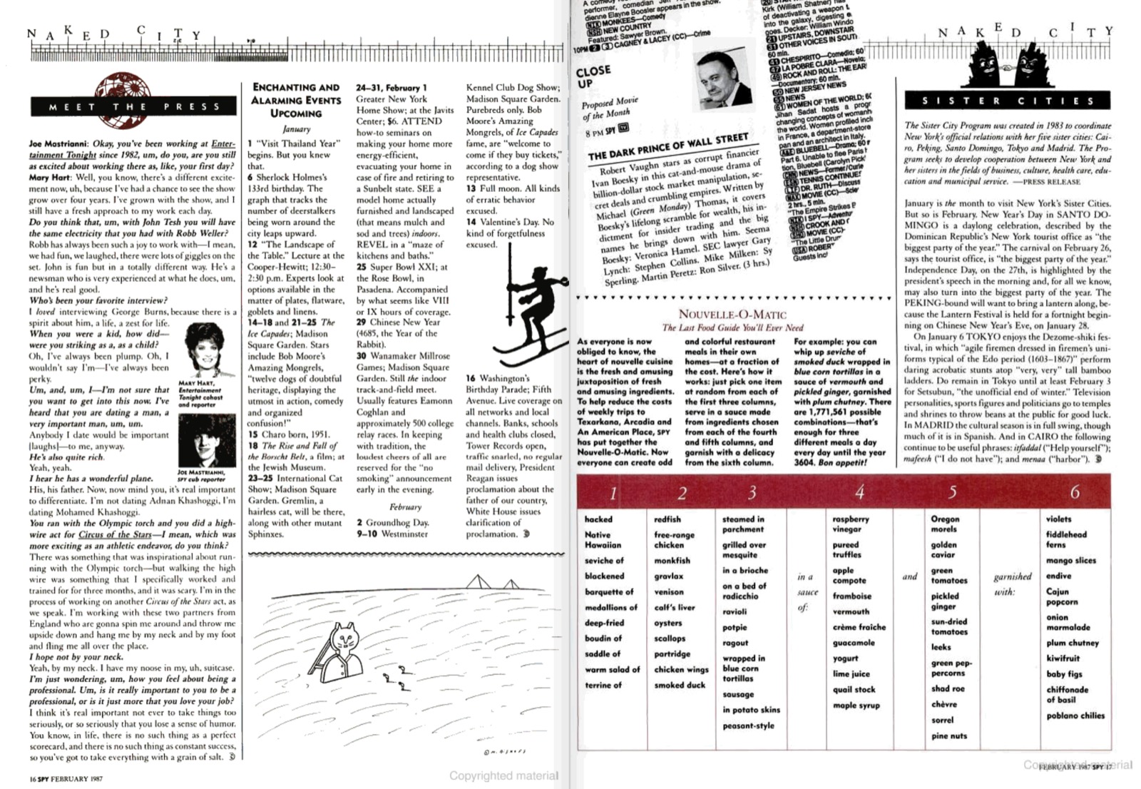
A multiple-choice quiz.
Diagonally set type.
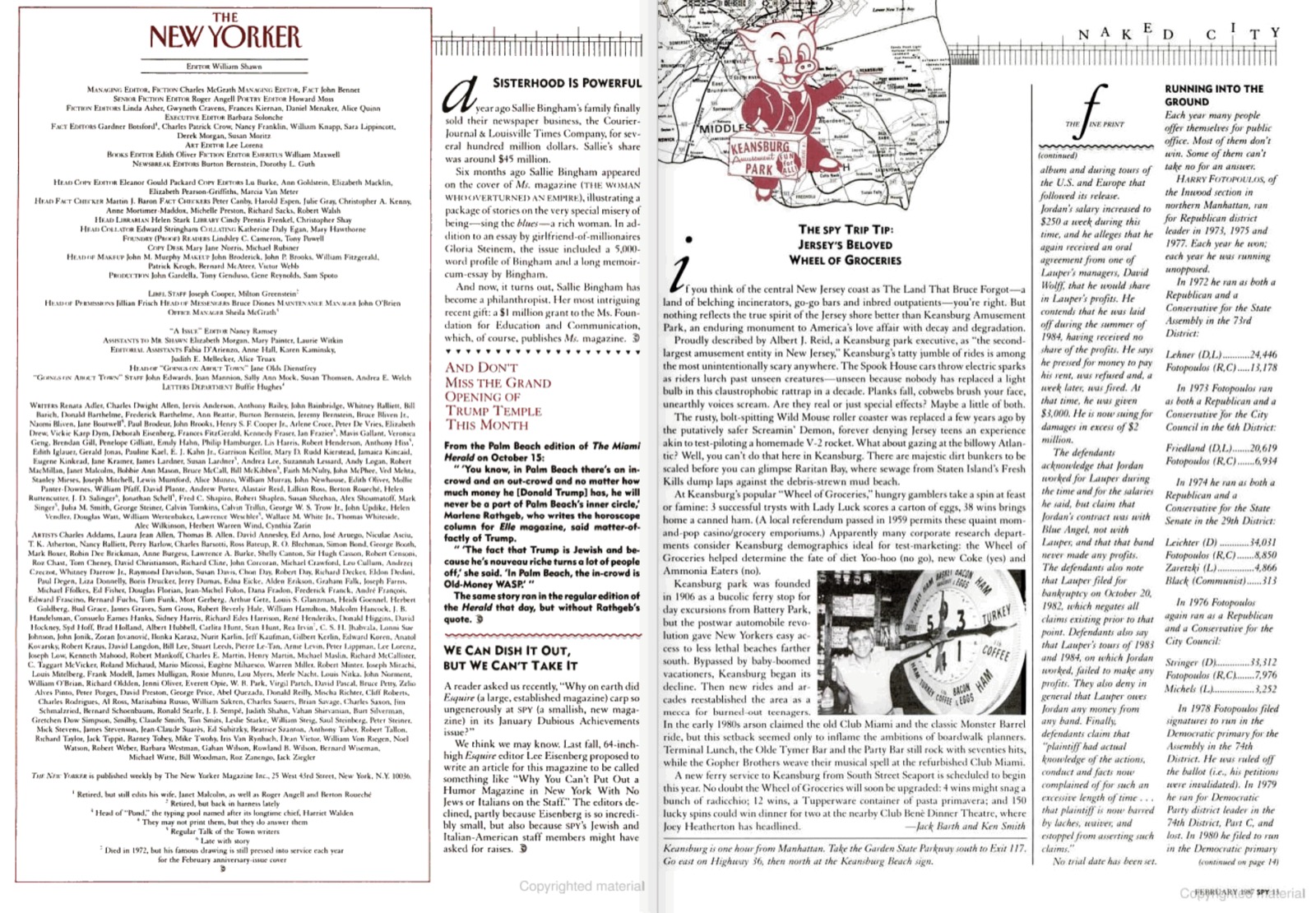
A complicated wide-format map of Manhattan’s commercial zones. Why? No idea.
Careful viewers will notice that despite the seeming chaos, the feature pages conform to a grid with two inner columns of the same size, and a smaller outer column. (Another idea stolen for Typography for Lawyers, and which persists into the web version of Practical Typography).
In the headline, the Garamond italic letters are pushed together tightly, emphasizing their peculiar differences in height and angle.
In this spread, the outer and center colums are merged on the left-hand page …
… and in this one, the inner columns are split in half and converted into a 3+3 column layout with interspersed photos. I counsel against overreliance on grids because it tends to lead to a false sense of superiority. This, however, is galaxy-brain grid-fitting.
In the last section of the issue, a switch to a simple three-column layout (usually this is the part of the magazine where you have to find enough space for the ends of stories that you didn’t make space for earlier).
The legacy of Spy
Spy endured various ups, downs, buyouts, and reboots before it ended permanently in 1998. A victim of the internet? Maybe to some degree. But as the ’80s yielded to the ’90s, the center of national cultural gravity shifted from New York City to Silicon Valley—where it has remained. Spy’s primary focus on the NY financial, media, and social scene left it stuck in an unfashionable niche.
In terms of design, Spy’s closest successor today is probably New York magazine, which continues its typographic exuberance—too many fonts is never enough.
Was there ever a Spy for the tech industry? Gawker, perhaps. Though in general, tech journalists have always had a cozier relationship with their subjects than financial and media journalists. Over decades, tech companies and their CEOs have leveraged this coziness to normalize the idea that criticizing tech for any reason is anti-progress, anti-jobs, anti-prosperity—in short, anti-American.
This is, of course, horseshit. Those who concentrate and control wealth should always be held to higher scrutiny. The people Spy wrote about—including the short-fingered vulgarian—knew this. They appreciated that their existence depended on a certain capitalist kayfabe, for which they were well paid, thus it behooved them to go along with the joke.
Tech bigwigs, by contrast, have competed in a downward spiral toward a state of total humorlessness. Their art form is the grievance of privilege. (By strange coincidence, this group is predominantly wealthy, white, and male.) Gawker was eventually murdered by a tech billionaire who didn’t like being the subject of their coverage. A few years ago, even I was smeared by a rich tech CEO after I wrote skeptically about his company’s product. To paraphrase the title of a book by Spy contributor Joe Queenan—if you’re tweeting about me, your startup must be in trouble. Though Twitter, always a cesspool, has been increasingly refashioned as the safe space for the powerful to conduct performative displays of self-pity and punching down.
“But dude, what does this have to do with typography?” Typography, and the words underneath, are expressive. But more than that, they’re tools that can be used—by anyone—to level a playing field—anywhere. Sometimes the goal of typography is to make things pretty. But sometimes it’s to afflict the powerful. Spy’s typography was exuberant, beautiful, chaotic, swung for the fences, and blew shit up. Whether it influenced my creative character, or confirmed what was already germinating, is hard to say. But the idea of subversive uses of beauty has been with me ever since.
Friends and colleagues tease me about my refusal to touch social media, or sell my fonts through resellers, or use certain software programs. I try not to be an absolutist about these things. But yes, I’m highly resistant to deploying creative energy within the confines of a box that a profit-seeking entity has defined. That’s how they control farm animals too. To have a voice at all is a privilege. Who would waste that?
update, 53 days later
The senior US senator from New Hampshire, Jeanne Shaheen, darkly warns President Biden of political consequences for stripping NH of its position in the primaries.
update, 61 days later
New Hampshire still mourns the loss of the Man in the Mountain, 20 years after it collapsed.